Christa Reuter Riegen’s interpretation of Henri Matisse’s “The Green Line” (La Raie Verte) also known as Madame Matisse, illustrates Riegen’s ability to capture the fundamental elements of the original painting. She celebrates the iconic painting, making it her own; it is not a duplicate, it is a refreshing portrait of Matisse’s wife.
Both Matisse and Riegen use the flat background colors to provide intensity with complementary varied red and green. The only difference is that Riegen uses brighter shades to take on a more definitive “Pop” feel. Likewise, Riegen gives Madame Matisse bigger, bolder red lips and elongates her eyes with pronounced shadows on her upper eye sockets. Riegen also makes it appear that Madame Matisse might have a bustline.
Riegen, an artist-antique dealer for numerous years framed the painting with an oversized vintage oak frame that she painted green and then highlighted it with gold undulating painted lines and dots. These lines and dots reflect Matisse’s very mature years where he used scissors to create paper cut-outs. Once again, Riegen uses Matisse as inspiration for this artwork.
The original portrait upset the French art world when it was first displayed in Paris in 1906. Now it hangs in the Statens Museum for Kunst, Copenhagen.
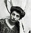
Riegen was born in Sindorf, Germany, January 24, 1943. She immigrated to New Jersey with her family to work on her uncle's chicken farm. She graduated from Hunterdon Central High School in 1961 and was a life-long student of art, oil painting and working in pastels and charcoal. These were her favorite mediums. In 1998 Riegen obtained her United States Citizenship.
She loved collecting and selling antiques along with her husband. Together they traveled throughout the United States on many antiquing adventures where they would acquire stock of all sorts to sell in her store, Christa's World Antiques, Little Rock, AR. Riegen retired to Florida and passed away on April 3, 2020.
 |
Madame Matisse |
At the time of the painting, 1905, Matisse was part of a small modern movement called the les fauves (the wild beasts). The name came from their sheer strident use of color and wild brushstrokes. Matisse’s work would have been rejected by the major salons in Paris with this portrait. He creates no personification of female beauty in his wife’s portrait, it is a highly simplified painting. He uses a green line down the center of her forehead, continuing down her face and then on to her neckline. The green line represents a shadow upon her face that was startling, and the background was filled with three swatches of colors that looks like a colorfield painting straight out of the 1950s.
Ms. Riegen’s refreshing interpretation of Matisse’s work grabs the essence of the portrait yet making it a post-painterly abstraction. She uses form, color, texture and scale with similar directness; and her vigorous brushstrokes are noticeable up close, then fade away from across the room.
Ms. Riegen radiates authority by giving Madame Matisse a larger hairdo with a more pronounced bun, and she sharpens the triangular bob in her hair. She provides her with yellow-flesh skin that is molded with broad strokes. She improves on Matisse’s neckline and the flat background colors work with Madame’s dress and collar.Both Matisse and Riegen use the flat background colors to provide intensity with complementary varied red and green. The only difference is that Riegen uses brighter shades to take on a more definitive “Pop” feel. Likewise, Riegen gives Madame Matisse bigger, bolder red lips and elongates her eyes with pronounced shadows on her upper eye sockets. Riegen also makes it appear that Madame Matisse might have a bustline.
Riegen, an artist-antique dealer for numerous years framed the painting with an oversized vintage oak frame that she painted green and then highlighted it with gold undulating painted lines and dots. These lines and dots reflect Matisse’s very mature years where he used scissors to create paper cut-outs. Once again, Riegen uses Matisse as inspiration for this artwork.
The original portrait upset the French art world when it was first displayed in Paris in 1906. Now it hangs in the Statens Museum for Kunst, Copenhagen.
Riegen was born in Sindorf, Germany, January 24, 1943. She immigrated to New Jersey with her family to work on her uncle's chicken farm. She graduated from Hunterdon Central High School in 1961 and was a life-long student of art, oil painting and working in pastels and charcoal. These were her favorite mediums. In 1998 Riegen obtained her United States Citizenship.
She loved collecting and selling antiques along with her husband. Together they traveled throughout the United States on many antiquing adventures where they would acquire stock of all sorts to sell in her store, Christa's World Antiques, Little Rock, AR. Riegen retired to Florida and passed away on April 3, 2020.
References and Documentation:
- Christa Riegen (1943-2020) Obituary: From - Legacy.com Chronicleonline.com
- The Portrait of Madame Matisse: wikipedia.org/wiki/TheGreenStripe
©2024. Waller-Yoblonsky Fine Art is a research collaborative, working to track artists that got lost and overlooked due to time, changing styles, race, gender and/or sexual orientation. Our frequent blogs highlight artists and art movements that need renewed attention with improved information for the researcher and art collectors. The blog and photos were created by Mr. Waller and all written materials were obtained by the Fair Use Section 107, of The Copyright Act. #waller-yoblonskyblogspot #walleryoblonskyblogspot #christariegen #christariegenhomassasprings #Christariegenartist
Comments
Post a Comment