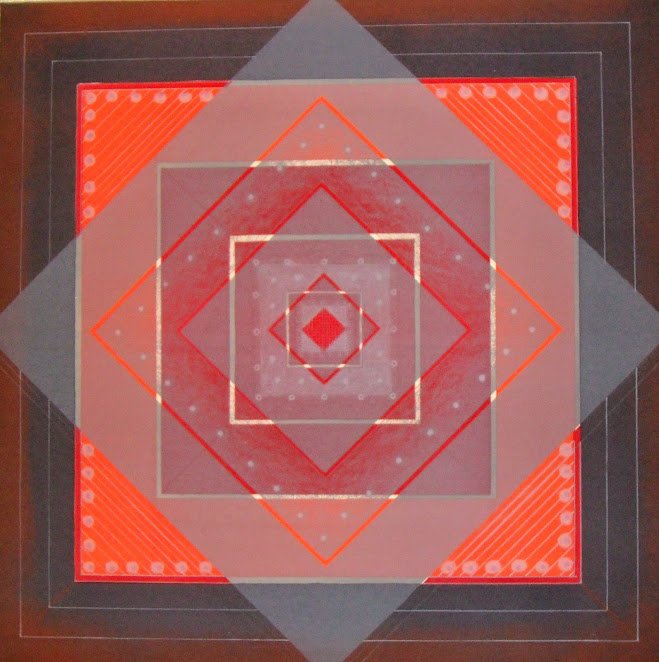
Tom Salvatore Fricano arrived as a young college instructor at California State University, Northridge in 1963. His prior work from the late 1950s was mostly abstract. We are not completely sure, but it appears that with his arrival to California he started to take on a style that is a cross between optical (aka op/kinetic art) and modern mandala art. Optical art was about using mathematical designs and mandala art is about creating geometric patterns that represent the cosmos symbolically. In many respects this is so Southern California, his artwork during this period is about radical balance, that perhaps is influenced by traces of Buddhism/Hinduism mandalas establishing the sacred within his art.
Some might consider Fricano a second or third generation hard-edge abstractionist because of his California artistic influences, and we are not sure if his art prints from this period take on any religious meaning or if this was a later attribution. Yet there were numerous op artists during this time balancing line, color and geometric shapes and angles in the 1960s. There was Victor Vasarely in France and Frank Stella in New York, but Fricano was doing something fresh in the Beverly Hills. He was creating illusions by putting the outer square on a 45 degree angle and then cutting off the tips, almost rounding out the mathematical equation, supporting the theory that he was influenced by mandalas which are frequently round (illustrated below).
 |
Signed in Pencil - Tom S. Fricano
Approximately 21" X 21"
Edition - 70/120
Touchstone Publishers Ltd., NYC, Original Graphic label on the reverse
|
In these works, your eye continues to focus on the center, in this case a red square at 45 degrees, followed by right angle squares and more 45 degree angled squares. From an optical illusionism point, there appears to be at least eleven or twelve squares moving in different directions, creating a grid arrangement.
Kinetic vibrations to the eye are created by patterning and color gradation. Dove gray is layered over bright candy apple red and glow orange, creating lines of various tones. In this regard, he used a variety of devices to provide complexity and heighten illusion - with a depth of field.
Prior to Fricano arriving in California, he received his BFA from Bradley University (1953) and his MFA from the University of Illinois, Urbana (1956). He currently is Professor Emeritus at CSU-Northridge. According to Who, Who in American Art, he was born in Chicago in 1930 and had a stellar career including: Fulbright scholar, Italy, 1960-1961; Louis Comfort Tiffany grantee, 1965, California State University research grantee, 1968, 69, 71, 74, 78, 79, California State University research grantee, 1988; John S. Guggenheim Memorial fellow, 1969-1970.
His work is in such locations as the Library of Congress, Philadelphia Museum of Art, Art Institute of Chicago, Los Angeles County Museum of Art, Detroit Institute of the Arts, and many University/College collections around the county. In the 1980s he was represented by the premier Beverly Hills - Louis Newman Galleries.
Tom Fricano working on a print - Artist and former chair of the department at CSUN and an honorary LAPS Member.
Photo provided by the Los Angeles Printmaking Society.
Comments
Post a Comment