I first saw the painting across the way, it spoke to me and provided deep curiosity, I walked closer. The blazing color composition with geometric lines was signed in block letters, “Marie Wilner” and I determined it was going to be mine. I flipped the painting over, there was a vintage framing label from Joseph Grippi, who was located at an upscale New York address. Grippi had been the framer for the famed Jackson Pollack, a first generation abstract expressionist. The framing style and the work clearly said mid-century modern abstraction. I purchased the work, paying the full price, and walked away.
Later in the day I did some internet research on Ms. Wilner, there was a plethora of sales and biographical information, yet I was further intrigued. I spent the next day researching my art books, records from the New York Times and discovered her life was an open book. The New York Times had kept track of her gallery openings from 1952 - 1969, including the name of the gallery, address, dates with one-liners about her work, such as: “Marie Wilner, whose semi-abstract figures are deeply dyed in irrationality.”
Wilner was born in Paris, went to Hunter’s College in NYC, and continued her studies at the Artists Student League and New School of Social Realism with some prominent teachers. Yet, I was still mystified; why was her life so documented and yet so unknown? Many avant-garde women artists from the mid-century were overlooked, and only recently have there been national recognition and block-buster museum shows.
The abstract women artists who have recently received recognition include women who had famous husbands in the abstract expressionism movement including Elaine de Kooning (wife of Willem de Kooning) and Lee Krasner (wife of Jackson Pollock). Others had the ability to hang in there or alter their names to sound like men such as Micheal West who was born Corrine Michelle, and Jay Defoe born Mary Jane Defoe. Anyway, there was an entire list of early women abstract adaptors that have been left out of American art history.
Perhaps in Wilner’s case it is as simple as there was no one left to manage her artistic estate and to keep her work in the forefront of collectors. In the end of her life, there was no retrospective that encompassed her life’s work with a catalogue. And it is also possible that many of the galleries that showed her work folded and are now non-existent; that will destroy your auction records. Or maybe it is that she died early and unexpectedly at 72 years of age. All of that matters, yet Wilner was an accomplished, colorful artist of her era, and having one of her fine-art works on a wall would be appreciated by any collector, as in the case of the painting below.
Wilner started with a full-sheet of watercolor paper and proceeded to create the perfect watercolor storm, commingling the different colors: blue, red, greens and some light element of pink. Next she added black lines, and after the watercolor dried, she added blue pastel, that she smudged in areas. In a 1961 artistic review by Michael Engle, put it this way: “Using a wide brush, she applies several bold sweeps of dilute color. Then she steps back and studies the resulting design for clues of the possibilities”. Using these bold strokes, she creates the background that looks like the northern lights dancing in the dark; it takes on an Aurora Borealis moment. She creates a showstopping beauty like the northern lights, an astronomical occurrence that causes a cavalcade of colors across the night sky.
 |
| "City Abstraction" Watercolor, Pastel and Gouache on Paper Image Size: 14.5 X 20.5 Inches Signed Center: Marie Wilner |
The Aurora Borealis is made of solar wind that gets past the magnetic field and travels towards the earth, as the solar winds hit the particles in the earth’s atmosphere, those elements release energy and create this luminous light show; likewise when Wilner plays with color her works create an artistic luminous show. In this case, it is upon these colors she builds a cityscape using diluted white/gray gouache lines, sometime known as "white writing" that was first used by Mark Tobey. Tobey used this gestural technique when he created his famous 1935-36 "Broadway" painting that is now part of the Metropolitan Museum of Art, NYC. It is most likely that Wilner would have seen Tobey's works of New York City.
Like Tobey, Wilner's white-gray lines are a continuous cross between squiggles and electrocardiogram charts that sometimes go wild and sometimes they flatline. She makes the most out of the gouache, creating dabs for windows, squiggles for aerial towers, lines for multi-storied buildings, creating an expressive skyline. Again, Engel describes one of her other paintings as: “a fog of subdued hues with brief gems of real color that imply the not-quite-seen presence of a city”. I agree with Engel, the first glance at the composition, does not reveal the varied buildings. Upon closer inspection the line-drawing reveals the crowded cityscape, where buildings overlap each other. Wilner charges this painting with nighttime excitement.
Hopefully, as time goes on, there will be a reevaluation and reappraisal of her active years, however we are now going to celebrate Wilner’s significant accomplishments to the world of art and abstract expressionism. There are numerous references and biographical information below that document the life and work of Marie Spring Wilner.
References:
Books/Article:
Birth place: Paris, France Addresses: Bronx, NY
Studied: Hunter College (B.A.); Art Student League; New School Social Res., with Camillo Egas & Samuel Adler.
Exhibited: PAFA, 1961; Butler IA, 1963; Sheldon Swope Mus., 1968; Tweed Mus., Univ. Minnesota, 1969; Salon Autumn, Paris, 1972;
Awards: gold medal, Ann. Exhib. American Artists Professional League; Grumbacher purchase prize, National Association Women Artists Annual; bronze medal, 3rd Biennale Int., Ancona, Italy.
Member: Royal Soc. Art, London (life fellow); Int. Arts Guild, Monaco; Nat. Assoc. Arts & Letters; NAWA (gallery chmn., 1962; jury member, 1965; chmn. jury awards, 1967); Soc. Encouragement Progress, Paris (chevalier, 1968; officer, 1971).
Work: Tweed Mus., Univ. Minnesota; Norfolk (VA) Mus.; Mus. Georgia; Bridgeport (CT) Mus.; Birmingham (AL) Mus.
Gallery Representation (1970s): Dickson Gal., Wash., DC & Sue Fischman, Fort Lauderdale, FL.
Preferred media: oils, watercolors, collage, plastic. Framer: Joseph Grippi (1950-60) - Mr. Grippi was the framer for Jackson Pollock.
©2022. Waller-Yoblonsky Fine Art is a research collaborative, working to track artists that got lost and overlooked due to time, changing styles, race, gender and/or sexual orientation. Our frequent blogs highlight artists and art movements that need renewed attention with improved information for the researcher and art collectors. The photos and blog was created by Mr. Waller and all written materials were obtained by the Fair Use Section 107, of The Copyright Act. #waller-yoblonskyblogspot #walleryoblonskyblogspot #mariewilner
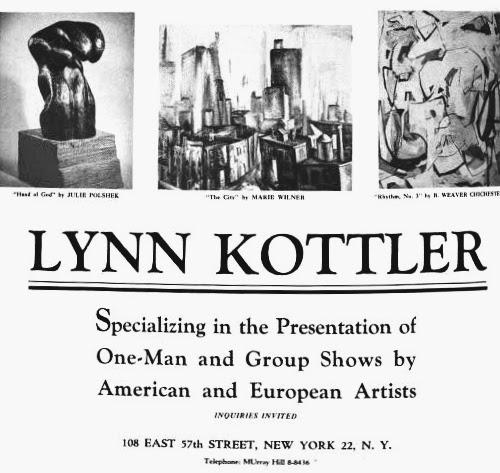 |
| An Advertisement from the ArtNews Annual, 1952 Features "The City" by Marie Wilner (Center Above) An Exhibit at Lynn Kottler Gallery |
Books/Article:
- Jaques Cattell Press, Who’s Who in American Art, 1976, R.R. Bowker Company, 1180 Avenue of the Americas, New York, New York, Copyright 1976 by Xerox Corporation. Page 607 - Details below.
- Bob Creps, Biographical Encyclopedia of American Painters, Sculptors & Engravers of the U.S., Dealer’s Choice Books, Inc., Land O’ Lake, FL, Copyright 2002, Page 1496.
- Michael M. Engle, LL. D., Art Adventures, Design, Vol. 63, Issue 1; Marie Wilner’s Paintings Begin as “Happy Accidents” 1961, Page 20/21.
- Lynn Kottler Gallery, 108 East 57th St., June 11, 1954, Show of twenty-nine paintings by different artists: “Marie Wilner’s flower piece is bold.”
- Barzansky Gallery, 644 Madison Ave., Mar. 30, 1955, “Marie Wilner, whose semi-abstract figures are deeply dyed in irrationality.”
- Gallery 21, 21 East Sixty-Third St., May 22, 1955, Watercolors by Marie Wilner
- Gallery 21, 21 East Sixty-Third St., May 27, 1955, The watercolors by Marie Wilner “swarm with symbols and poetic images. In fact, they ride so high and complex that one or two pictures might almost be considered bas-reliefs.”
- Coeval, 100 West Fifty-Sixth St., Paintings, Oct. 30, 1955
- Caravan Gallery, 132 East Sixty-Fifth St. Works, Feb. 3, 1957
- Bodley Gallery, 223 East Sixtieth St., Paintings, April 13, 1958
- National Association of Women Artists Awards - Prizes included Marie Wilner, May 25, 1962
- Pietrantonio Galleries, 109 Main St., Westhampton Beach, “Out of Town”, July 21, 1963
- Revel Gallery, 11 West 56th St., Recent Paintings, Oct. 13, 1963
- The ArtNews Annual, 1952, photograph of “The City” by Marie Wilner, Lynn Kottler Gallery Advertisement, pictured.
- ArtNews, Feb. 1969, P. 69, Marie Wilner (Pietrantonio; Feb. 1-28). Crowds her canvas with multiple, contrastingly textured layers of pigment in small knifed strokes to form romanticized visions of landscape, family and private worlds. W.J.
- New York Magazine, Feb. 24, 1969, Exhibition Announcement at Pietrantonio Galleries.
- University of Florida, Bryan Lounge, Oct. 1965, The Florida Alligator: “Poetic, expressive, quality in romantic, mysterious art.” The exhibit was sponsored by Revel Gallery, NYC.
- Mercyhurst College, McAuley Hall, Jan. 1966
- University of Minnesota Duluth, Tweed Gallery, Oct-Nov, 1969
- Xavier University, University Center, May 1975
Birth place: Paris, France Addresses: Bronx, NY
Studied: Hunter College (B.A.); Art Student League; New School Social Res., with Camillo Egas & Samuel Adler.
Exhibited: PAFA, 1961; Butler IA, 1963; Sheldon Swope Mus., 1968; Tweed Mus., Univ. Minnesota, 1969; Salon Autumn, Paris, 1972;
Awards: gold medal, Ann. Exhib. American Artists Professional League; Grumbacher purchase prize, National Association Women Artists Annual; bronze medal, 3rd Biennale Int., Ancona, Italy.
Member: Royal Soc. Art, London (life fellow); Int. Arts Guild, Monaco; Nat. Assoc. Arts & Letters; NAWA (gallery chmn., 1962; jury member, 1965; chmn. jury awards, 1967); Soc. Encouragement Progress, Paris (chevalier, 1968; officer, 1971).
Work: Tweed Mus., Univ. Minnesota; Norfolk (VA) Mus.; Mus. Georgia; Bridgeport (CT) Mus.; Birmingham (AL) Mus.
Gallery Representation (1970s): Dickson Gal., Wash., DC & Sue Fischman, Fort Lauderdale, FL.
Preferred media: oils, watercolors, collage, plastic. Framer: Joseph Grippi (1950-60) - Mr. Grippi was the framer for Jackson Pollock.
 |
| Framer Tag - J. Grippi |
_____________________________________________
Comments
Post a Comment